
Since 2016
How this site was built
This portfolio has grown alongside my career. Every version is still in its Git history, so here they all are: what I was learning at the time, and what changed.
2016
A Bootstrap page and a PDF
I started studying software development in Brazil between 2015 and 2016. The first version of this site was a single Bootstrap 3 page: a photo, the online courses I had taken, and my résumé as a PDF. A few months later, in May 2016, I moved to New Zealand barely speaking English.
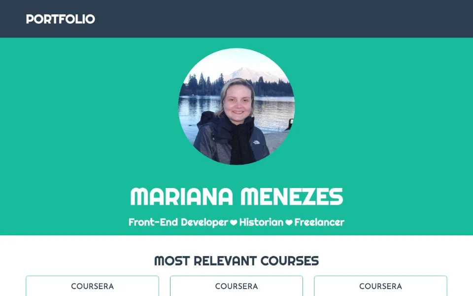
The site in 2016 2017
jQuery, bundled with webpack
After three months of English classes I started a frontend nanodegree at Udacity, and began choosing a direction. The site was rebuilt with jQuery and webpack: a full-screen gradient, a navigation bar for every section and a big “Let’s talk!” button.
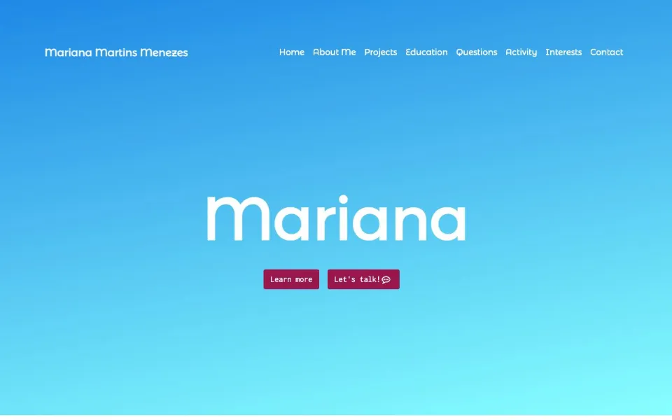
The site in 2017 2019 – 2022
Gatsby and React
My first frontend job, at Kathmandu, made me sure frontend was what I wanted. At Phocas I chose React and fell in love with designing interfaces and working closely with designers. The site moved to Gatsby in 2019 and was updated with each new role until 2022. It also introduced the light-blue “M” that still sits behind Margot in today’s logo.
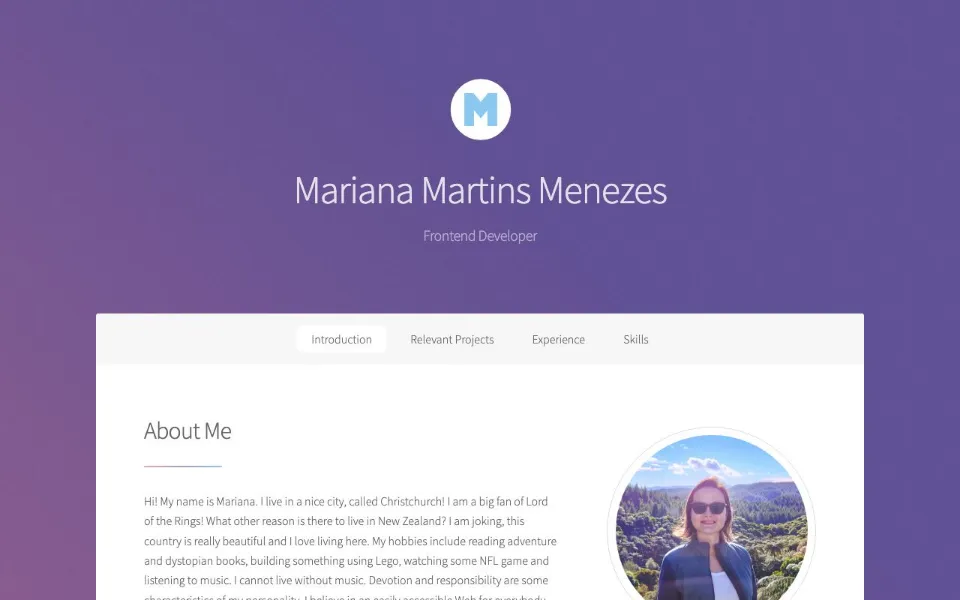
The site in 2019 – 2022 2025
Starting again from scratch
In September 2025 I started again with Vite, React, TypeScript and Tailwind CSS. The “M” became a logo with Margot at a laptop, and the site found the soft gradients, glass panels and dashed dividers it still has.
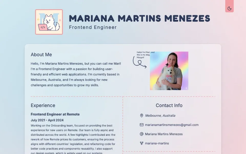
The site in 2025 2025 – 2026
Edited, not just added to
Most of the work since has been changing my mind, one commit at a time:
- The colour system was reorganised three times: functional names, then HSL with a dark theme, then a numbered scale.
- Tailwind CSS moved to version 4, with the design tokens defined in CSS.
- A Skills section arrived in November 2025 and was gone early in 2026.
- Experience went into an accordion, then back out, with every role open.
- The Learning Shelf grew into Margot’s Picks: more than a hundred books, courses and films, rated in Margots.
- An animation library came in for scroll and hover effects, and later made way for CSS and the browser’s Web Animations API.
Today
Measured, not assumed
The latest chapter is about checking the work rather than trusting it. Contrast and focus are measured on the rendered pixels in a real browser, in both themes and on mobile, because automated checks in jsdom never see colour at all. Every page is prerendered to HTML and hydrated without mismatches, and a first visit downloads a third less JavaScript than before.
- 100 kB of JavaScript on a first visit, gzipped (was 163)
- 97+ Lighthouse performance on mobile
- 5.5:1 focus ring contrast (was 2.1:1)
- 0 cookies, analytics included
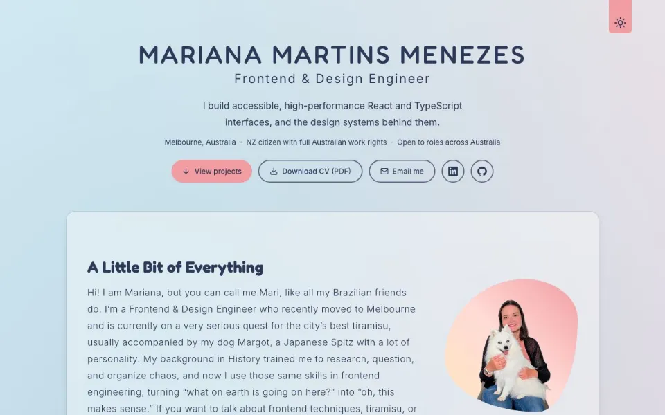
The site in November 2026
The small things
- The Learning Shelf cards are cut like cinema tickets with a CSS mask, and the notches move when the card changes layout.
- Ratings are counted in Margots: an “M” with her paw on it, and sparkles for a perfect five.
- Where the browser supports it, the ticket corners use corner-shape: squircle.
- Every animation respects reduced motion, from the scroll reveals to the fun fact cards.