
Case study
Fit My Space
A search engine for home organisation products across stores, filtered by room and by store, and the design system I am building for it.
Work in progress. The search app works end to end; the design system is what I am building now. At v0.7.0 it has 32 components and 22 patterns in Storybook, which is its source of truth; Figma holds the brand, the Button and the icons. Nothing in the app uses it yet: its components move onto it next, one at a time, in an order already written down.
- Role
- Design and frontend, end to end
- Built with
- Next.js, TypeScript, Tailwind CSS, TanStack Query, Zod, Radix Primitives, Style Dictionary, Storybook, Stylelint, GitHub Actions
- Last updated
Decisions written down
A design system is mostly decisions, and a decision that lives in my head is lost the day I forget why. So the ones that outlive a pull request are Architecture Decision Records in the repository: what was decided, why, and what follows. A decision that changes gets a new record, and the old one stays.
The rest of the process is written down too. A breaking change gets a BREAKING CHANGE: footer and a migration note, and the old API keeps working, marked @deprecated, for one minor version. Every pull request answers “Breaking?”, release-it turns the conventional commits into a version and a changelog, and a Contributing & Accessibility page in Storybook gives the order to build a new component in, from tokens to patterns.
Code is the source of truth
Storybook is where design review happens. Figma holds the brand and exploration and is not expected to mirror every component, so a gap there is a choice, not drift.
A combobox written by hand
Radix has no combobox, and a headless library would bring a second interaction model. So
Comboboxfollows the WAI-ARIA list autocomplete pattern, witharia-activedescendantand the result count announced.Migrate one component at a time
One legacy component is replaced across the whole app per pull request, simplest first, and deleted in the same pull request. The app is never half on two versions of one thing.
Check the journeys before migrating
Before the first migration pull request, Playwright tests will cover search, filters, pagination and the not-found page, with selectors on roles and names so they survive the swap.
Three tiers of tokens
In the design system every visual decision lives in a token, and references only point one way. Primitives say which values exist, semantic tokens say what a value is for, and component tokens are the component’s own API: what the primary button uses when it is hovered, focused or disabled. I followed Brad Frost’s methodology for the split.
Style Dictionary turns the three tiers of JSON into 1,434 CSS custom properties. Because it keeps each reference as a var(), changing what “brand” means is a one-line change in tier 2, and every component follows.
It also writes every token, with its resolved value, to a JSON file that the Storybook foundation pages are built from: colour, spacing, size, radii, borders, shadow, layers, motion, focus and typography. The documentation cannot fall behind the tokens, because it is the tokens.
Tier 1 · Primitive
colour.sage.700
--ds-colour-sage-700: #335f3f;Tier 2 · Semantic
semantic.colour.background.brand.base
--ds-semantic-colour-background-brand-base: var(--ds-colour-sage-700);Tier 3 · Component
component.button.primary.fill.background.default
--ds-component-button-primary-fill-background-default: var(--ds-semantic-colour-background-brand-base);In use
Button.module.css
.fill-primary { background-color: var(--ds-component-button-primary-fill-background-default); }
var() in the generated CSS.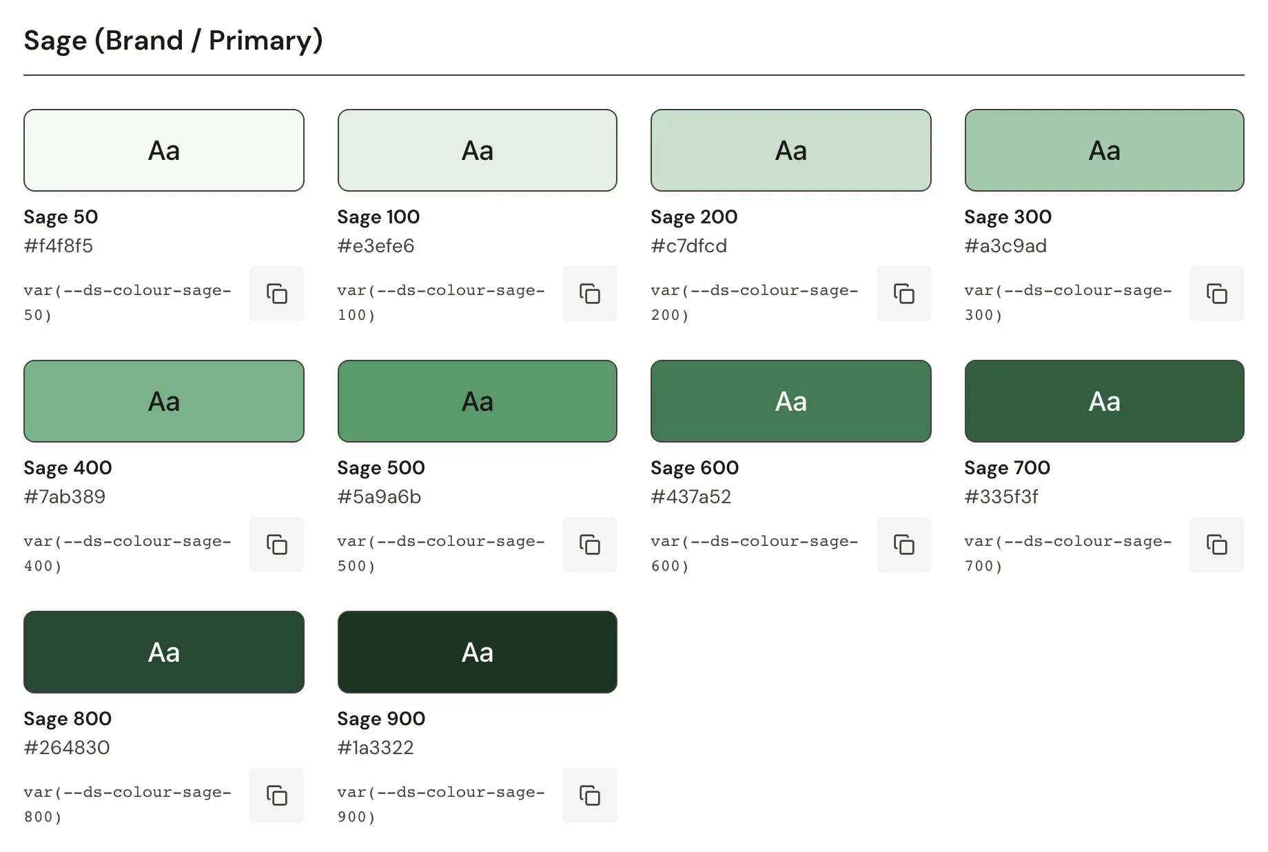
Accessibility the compiler enforces
Components are composed on Radix primitives rather than taken from a component library. Radix brings the keyboard and screen reader behaviour; the markup, styling and states stay mine.
The Button’s props are a discriminated union. Give it visible text and aria-label is optional; make it icon-only and aria-label becomes required. Forgetting it is a type error in the editor, not a finding in an audit months later.
type ButtonWithChildren = ButtonBaseProps & {
  children: ReactNode;
  'aria-label'?: string;
};

type ButtonIconOnly = ButtonBaseProps & {
  children?: never;
  'aria-label': string; // required: nothing else names the button
};

export type ButtonProps = ButtonWithChildren | ButtonIconOnly;

// ✗ Type error: property 'aria-label' is missing
<Button variant="secondary" appearance="outline" size="sm" icon="trash-2" />

// ✓ Compiles
<Button variant="secondary" appearance="outline" size="sm" icon="trash-2"
  aria-label="Remove from list" />


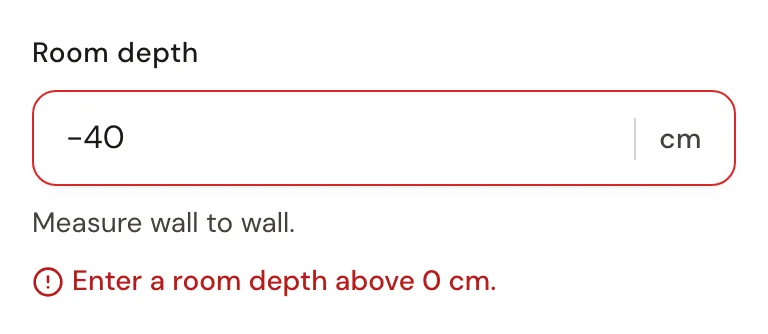
Forms follow the same rule. A TextField marked invalid must be given an error, so a field can never turn red without saying what went wrong (WCAG 3.3.1). The field wires its label, hint and error to the native input with htmlFor and aria-describedby, and a screen reader hears the hint before the error.
Rules the pipeline enforces
A rule in a README holds until someone is in a hurry. So each rule of the design system has a check that fails the commit or the CI run, and the Storybook on GitHub Pages only publishes once every CI job has passed.
No component skips a tier
A test reads the token JSON and fails if a tier-3 token points past tier 2, and Stylelint rejects tier-1 tokens in component CSS.
Every state meets WCAG 2.2 AA contrast
A test resolves the colour tokens of 25 components to hex and checks each pair in every interactive state: 4.5:1 for text, 3:1 for borders and focus rings. It needs no browser, so it covers the hover and active states axe never sees.
Every token exists
A misspelled
var(--ds-…)fails silently in the browser. Stylelint checks the CSS, a test checks the TypeScript and MDX, andtokens:checkfails if tokens.css drifts from the JSON.The app goes through one door
ESLint rejects any import from inside the design system folder, so components can move without breaking the app, and only the icon registry may import Lucide.
Tested like a product
- 1,287 unit and integration tests
- 308 Storybook interaction and axe tests
- 1,434 generated CSS tokens
- 32 components, in 22 patterns
jest-axe checks cover the design system components, the app’s components and its not-found and error pages, alongside unit and integration tests with MSW standing in for the API. In Storybook, every story is checked with axe in a real browser, alongside its interaction tests. GitHub Actions runs them all on every pull request, with formatting, linting, types, the token checks and a production build.